Prints With/Out Pressure
Artists N-Z
Thomas Nason (American, 1889–1971)
A self-taught artist, Thomas Nason produced more than six hundred wood
engravings in his lifetime. Born and raised on a farm in Massachusetts,
he taught himself to draw at a young age. He spent his early adulthood
working at clerical jobs, visiting local printsellers in his spare time.
At age thirty-two, he set up a small printshop in his home and began
to earn a living from commissions for bookplates and book and magazine
illustrations. In the 19th century, wood engraving was the preferred
medium for book illustration, but by the turn of the 20th century it
had lost favor to cheaper, less labor-intensive techniques. Nason revived
this technique to reinforce the nostalgic charm of his rural scenes and
New England landscapes.
Thomas Nason (American, 1889–1971)
Summer Storm
Color wood engraving, 1940
Friends of the Print Room, purchased from the artist
This view of Lyme, Connecticut, was printed from three blocks in black,
gray-green, and olive-colored inks. Unlike many other artists working
with color printmaking at this time, Nason used subtle tones to produce
a chiaroscuro effect. He printed all his wood engravings himself, and
pulled hundreds of impressions of Summer Storm before assembling
an edition to his satisfaction.
Leonard Nelson (American, 1912–1993)
Leonard Nelson was born in Camden, New Jersey, and studied at Auburn
University, Alabama, the Pennsylvania Academy of Fine Arts, and the Barnes
Foundation. While stationed in Texas during service in the Army, and
during a subsequent trip to Mexico, he encountered Native American and
Pre-Columbian art, which influenced him to experiment with primitive,
hieroglyphic forms in his paintings and prints. Although he lived primarily
in Philadelphia, he associated with the group of New York School artists
who were the first generation of Abstract Expressionists. He went on
to frequent Stanley William Hayter’s printshop, Atelier 17, where
his inventive approach to printmaking was encouraged; this experience,
coupled with meeting Willem de Kooning in 1948, introduced gestural marks
into his intaglio prints and screenprints. Nelson took an unorthodox
approach to teaching art: to inspire students’ experimentation,
he created several devices composed of flat surfaces on which multicolored
shapes and a variety of objects could be continually rearranged. In 1951
he became an instructor at Moore College of Art, where he taught for
the next thirty years.
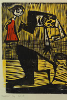
Leonard Nelson (American, 1912–1993)
Dance to Midzime
Woodcut, 1948
Norrie Fund
Nelson was frequently inspired by jazz, and many of his prints have
a lively sense of rhythm and improvisation. Dance to Midzime was
awarded a jury prize by the Philadelphia Print Club in 1948.
Harold Persico Paris (American, 1925–1979)
Harold Paris grew up immersed in the Yiddish theater community, of
which his father was part. Born in Edgemere, Long Island, he was a primarily
self-taught artist who became a sculptor and printmaker. During service
in the Army, he created models for the Corps of Engineers and learned
to work with plastics. He studied and taught during his travels in Europe,
funded by Guggenheim and Fulbright fellowships, and made prints at workshops
in New York, including Stanley William Hayter’s Atelier 17. In
1960 he moved to California to teach at the University of California,
Berkeley. At this time he also began to explore a wide range of materials
for his sculptures, from bronze and ceramics to cast pieces of rubber,
plaster, and plastic, which he frequently assembled into room-sized installations.
Harold Persico Paris (American, 1925–1979)
The Moloch Eats Every Day, from the Buchenwald Series
Lucite engraving, printed in relief, 1948
Gift of Shirley Paris
According to the Old Testament, Moloch was an ancient god to whom children
were sacrificed by fire. He has appeared frequently in art and literature
as a devourer of children, and has, over time, become generalized to
signify a malevolent force that requires extreme sacrifice.
Harold Persico Paris (American, 1925–1979)
Verloren, from the Buchenwald Series
Lucite engraving, printed in relief, 1948
Gift of the artist
With no formal art training, Harold Paris established his reputation
as a printmaker with his first suite of prints, the Buchenwald Series.
While serving in the Army, he was a reporter for the military newspaper
the Stars and Stripes, issued to soldiers overseas. He was assigned
to cover the Nuremberg Trials and became deeply moved by accounts of
the Holocaust, especially Buchenwald, one of the largest concentration
camps in Germany.
For this series, he engraved nine images in Lucite, a medium popular
in the 1940s and 50s. He inked and printed these plastic sheets like
a woodcut, with the result that the engraved lines appear white, and
the flat, raised surfaces printed black.
Helen Phillips (American, 1913–1995)
Born in Fresno, California, Helen Phillips studied sculpture at the
California School of Fine Arts in San Francisco. In 1937, while in Paris
on a scholarship, she began making prints at Atelier 17, under the guidance
of Stanley William Hayter, whom she married in 1940. She and Hayter left
Paris that year, and eventually moved to New York, remaining there until
1950, when they returned to Paris. After their divorce in 1970, Phillips
divided her time between Paris and New York. In her sculpture she responded
to the Surrealists and Brancusi, creating semi-abstract pieces, usually
of polished bronze. She was an enthusiastic experimenter in the field
of printmaking, and dedicated time and effort to devising a technique
for printing multiple colors from one plate in one run through the press.
Of her prints she once remarked: “My engravings are based on the
human form, part animal, part human…. I do not apply the term abstraction
to my work.”
Helen Phillips (American, 1913–1995)
Upon the Rock for Helen Phillips …, from the Ruthven Todd
portfolio
New York: Atelier 17, 1947
Open bite etching, printed as a relief print
Helen Phillips (American, 1913–1995)
Upon the Rock for Helen Phillips …, from the Ruthven Todd
portfolio
Open bite etching, printed as an intaglio print
Leona Pierce (American, 1921–2002)
Leona Pierce is known for her spirited color woodcuts of children at
play. She was born in Santa Barbara, California, to schoolteacher parents.
She studied in New York at the Art Students League and the New School
under Yasuo Kuniyoshi and Stuart Davis. She achieved success early and
by age thirty had widely exhibited her woodcuts and hand-printed textiles.
Around that time she married fellow artist Antonio Frasconi, who shared
her dedication to woodcut and her affinity for depictions of childhood.
 Leona Pierce (American, 1921–2002)
Marbles
Color woodcut, ca. 1950
Norrie Fund, purchased from the artist
In 1951 Leona Pierce wrote to Karl Kup, the Library’s Print Curator
from 1943 to 1968: “I wish to express my deep appreciation for
your aid in my application for a Tiffany Foundation Grant. Yesterday,
I received word that I am to receive one of the fellowships. Now I know
that I will be able to continue my work as I had hoped to. Thank you
again for your kind and invaluable assistance.” Kup was a great
champion of this generation of American artists, and consistently acquired
their work for the Library’s collection, sang their praises to
fellowship committees, and personally welcomed them on their visits to
the Print Room.
Bernard Reder (American, born Ukraine, 1897–1963)
Bernard Reder is known primarily as a sculptor of animated, baroque
figures, although he was also a dedicated printmaker. He was born in
Czernowitz, Bukovina (now part of Ukraine). After studying at the Academy
of Fine Arts in Prague, he supported himself by carving cemetery monuments
while sculpting in his spare time. At the suggestion of a friend, the
sculptor Aristide Maillol, he moved to Paris. Four years later, with
the outbreak of World War II, he joined the flood of Jewish refugees
and traveled to the south of France. He soon fled, via Cuba, to New York,
arriving in 1943. Two years later, after a serious illness left him partially
paralyzed, Reder began to focus on drawings and woodcuts, frequently
depicting biblical themes alongside more cryptic images that sprang from
his own imagination. He carefully inked and printed his woodcuts himself,
and although he printed standard editions, he often pulled only single
impressions of his prints. He frequently traveled from his home in New
York to Rome and Florence and created architectural designs in addition
to his other artworks.
Bernard Reder (American, born Ukraine, 1897–1963)
Angels of the Earth, from The Story of Noah
Woodcut, 1948
Norrie Fund, purchased from Grace Borgenicht Gallery
This print is from a series of thirty-seven woodcuts based on the Old
Testament figure Noah.
Bernard Reder (American, born Ukraine, 1897–1963)
Apocalypse of St. John
Set of 21 woodcuts, 1954
Cadwalader Fund
Apparition of Patmos
The False Prophet
The Four Horsemen
The Adoration of the Animal
The Babylonian Prostitute
The White Horse
Destruction of Babylon
The Kings of the Earth
Animal with Crown
One of the Seven Plagues
The Last Judgment
One of the Seven Plagues
The New Jerusalem
The Merchants
The Last Judgment
One of the Seven Plagues
Salvation of the Child
The Seven Angels
The Killers
Apparition with Four Animals
St. John
Reder’s experience as a sculptor is clearly manifest in this series
of woodcuts. He treats the woodblock aggressively as a three-dimensional
object, rather than simply a matrix for a two-tone image. By essentially
sculpting the block to varying degrees of relief, often using improvised
tools, he obtains printed textures and mid-tones not common to this medium.
His choice of a biblical subject, a frequent theme throughout his oeuvre,
affords him ample opportunity to demonstrate his profound knowledge of
the human figure.
Luigi Rist (American, 1888–1959)
Luigi Rist is known for his still-lifes of fruit, vegetables, and flowers,
made by the exacting Japanese woodblock printing technique. Born Louis
Rist, he was raised in Newark, New Jersey. At age forty, he began to
make prints. During a visit to an artist’s colony in Concarneau,
France, he met printmaker Morris Blackburn, who became his friend and
promoter. Back in New York, Blackburn invited him to an exhibition of
Japanese prints, and Rist became so intrigued by them that he taught
himself the process. Although historically Japanese printmaking was a
collaborative effort between artist, block cutter, and printer, Rist
assumed all the roles himself, designing, carving, and printing each
of his own prints. Using a brush, he applied inks made from powdered
pigments mixed with water and rice-flour paste, and hand-printed the
blocks by pressing on the paper with a flat pad, called a baren. This
method was different from the European mode of color printing, practiced
by artists such as Gustave Baumann, which used thick oil-based inks and
a press to print the wood blocks.
Luigi Rist (American, 1888–1959)
A Garden Opal
Color woodcut, 1943
Norrie Fund, purchased from the artist
In 1955, Rist explained his choice of subject matter: “My use
of vegetable and flower subjects is deliberate, as the shapes and forms
are basic and varied, and lend themselves to unlimited arrangements,
textures, forms, colors and abstraction. Also, my prints are limited
as to size, hence these forms appear on the prints in actual size, which
gives them added importance, visually and pictorially.” Many of
these subjects were grown by Rist’s wife, Ida.
Luigi Rist (American, 1888–1959)
Two Bunches of Grapes
Color woodcut, 1943
Norrie Fund, purchased from the artist
Rist printed approximately nine color blocks for Two Bunches of
Grapes. He described his typical procedure thus: “In the
cutting and carving of the several cherry blocks, of first importance
is the key line block. The impressions from the key block control the
register of the many impressions from the color blocks used to print
one or more colors. Any number of blocks may be used to print a given
print. Both sides of cherry wood boards are used, each side considered
a block, and as many as ten to twenty blocks are cut and carved.”
Clare Romano (American, born 1922)
Trained as a painter at Cooper Union, Clare Romano made her first prints—lithographs—at
Robert Blackburn’s Creative Lithographic Workshop in 1949. Her
early urban subjects were replaced by landscapes when she left New York
City for New Jersey, Truro, and Provincetown, where she and her family
lived and spent their summers. She also switched her allegiance to the
woodcut, developing imagery first in her paintings and drawings. Romano’s
woodcuts show her appreciation for the texture of the wood block, and
her penchant for creating a varied printed surface. In 1958, while in
Italy on a Fulbright Grant, she began to use cardboard and paper to build
her relief plates, and during a residence in Yugoslavia with the U.S.
Information Agency in 1965–66, she perfected the collagraph technique,
whereby she collaged materials (cardboard, cloth, found objects) onto
the printing plate with a thick gesso or built up form with modeling
paste. Romano has introduced generations of students to all aspects of
printmaking as a professor at the New School, Pratt Graphics Center,
and Pratt Institute, and as co-author with her husband, John Ross, of
several important printmaking handbooks.
Clare Romano (American, born 1922)
Pebbles and Side Pools of Truro
Color woodcut, 1963; issued by the International Graphic Arts Society
(IGAS), 1964
Bequest of Una Johnson
Describing this print for IGAS, Una Johnson noted that Romano “captures
the muted greens, blacks and translucent yellows of the rocks and pebbles
as they gleam through the quiet waves and diminishing tides. The resulting
interweavings of lines and forms are deftly integrated into a strong
but entirely pleasing design.”
John Ross (American, born 1921)
John Ross is an indefatigable printmaker—best known for his innovative
use of cardboard—and author. He was born in New York and studied
at Parsons School of Design and Cooper Union, where he met his future
wife and frequent collaborator, Clare Romano. A stay in Italy while serving
in the Air Force initiated an ongoing fascination with that country;
he lived there for several extended periods, and Italian subjects played
a major role in his work. An avid champion of hands-on instruction, he
gave numerous printmaking demonstrations in the United States and abroad
while serving as a representative for the United States Information Agency
in Yugoslavia and Romania. He taught at several universities and chaired
the Art Department at Manhattanville College in Purchase, New York. He
has greatly influenced a new generation of printmakers through the books
he co-authored with his wife. These printmaking manuals offer precise
and thorough instructions on the technical processes of various forms
of printmaking and have disseminated this knowledge to a wide, and appreciative,
audience.
John Ross (American, born 1921)
Duomo
Color cardboard relief print, 1959
Norrie Fund
Ross used cardboard as a base for building up a textured surface in
his collagraphs or, as here, treated it like a wood block for creating
relief prints: “The flexibility of cardboard, its ease of cutting,
and its availability make it an ideal material for a relief print….
The cardboard can be cut into and peeled away very much as wood is cut….
Varied color textures printed over each other can develop the color quality
with great richness.”
Anne Ryan (American, 1889–1954)
Anne Ryan started out as a writer, publishing a volume of poetry and
a novel in the 1920s. She lived in Greenwich Village, and many of her
friends were writers, actors, and artists, including the painter Hans
Hofmann and the sculptor Tony Smith, who encouraged her to paint. She
experimented with the color woodcut between 1945 and 1949, and while
her figurative subjects were influenced by the paintings of Georges Rouault,
Matisse, Cézanne, and Picasso, her abstract woodcuts show a kinship with
the work of Stanley William Hayter, Hofmann, Jackson Pollock, and other
friends associated with Abstract Expressionism. She preferred to make
color woodcuts using only one block, though she occasionally used up
to three. Like Louis Schanker she printed with oil-based paints, which
she applied with her fingers and small rollers to make each print unique.
She customarily printed on black paper, given to her by a photographer
friend, densely layering thick pigments interspersed with thin glazes
to realize varied surfaces and textures. After making more than one hundred
woodcuts, in 1949 she turned to collage, and devoted herself to that
medium until her death five years later.
Anne Ryan (American, 1889–1954)
Puerto
Color woodcut, 1945–49
Gift of Una Johnson
Lucia Autorino Salemme (American, born 1919)
A child of immigrant parents, Lucia Autorino was born in New York City
at the end of World War I. She studied at the National Academy of Design
as well as the Art Students League, and in 1940 was awarded a scholarship
to study with Hilla Rebay at the Museum of Non-Objective Art—the
original name of the Solomon R. Guggenheim Museum. Autorino’s conservative
style was transformed under the influence of the European-born Rebay,
who introduced a generation of Americans, including Guggenheim, to the
latest trends in abstraction. Like many others in this exhibition, Autorino
worked for the Works Progress Administration (WPA) and taught at the
Art Students League and New York University. She received a Pollock-Krasner
grant in 2000 to support her living and working expenses for one year.
She is the author of three books on painting.
Lucia Autorino Salemme (American, born 1919)
Little Black Abstraction
Linoleum cut, 1942
Friends of the Print Room
Louis Schanker (American, 1903–1981)
Louis Schanker was a key figure in the resurgence of interest in the
color relief print. As a technically innovative printmaker and as a teacher,
he influenced many of the artists in this exhibition. Trained at Cooper
Union, the Education Alliance, and the Art Students League, he made his
first woodcut in 1935, a challenging seven-color print, which already
reflected his appreciation for the School of Paris (he traveled abroad
from 1931 to 1933), German Expressionism, and the Japanese woodcut. Though
his early imagery was figurative, his work became increasingly abstract,
concerned with Cubist distortions of form and space, realized with bright
colors and tactile surfaces. While a member of the Graphic Arts Division
of the Federal Art Project, and later the supervisor of color woodblock
printing there, he developed new printing techniques. He layered oil-based
inks on top of each other, often before the previous layer had dried,
to realize dense, inky surfaces; he also printed colors over black ink,
giving the colors a special luminosity. For a time Schanker shared a
teaching studio at the New School with Stanley William Hayter, another
passionate experimenter, though with intaglio processes. Schanker believed
that “The possibility of invention … is one of the most intriguing
aspects of the woodcut.”
Louis Schanker (American, 1903–1981)
Forms in Action
Woodcut for Works Progress Administration, Federal Art Project, 1941
Gift to The New York Public Library
Louis Schanker (American, 1903–1981)
Indian Dance
Color woodcut for Works Progress Administration, Federal Art Project, 1941
Gift to The New York Public Library
Louis Schanker (American, 1903–1981)
Skaters
Color woodcut for Works Progress Administration, Federal Art Project,
1941
Gift to The New York Public Library
Louis Schanker (American, 1903–1981)
Static & Revolving
Color woodcut, 1945–46
Norrie Fund, purchased from the artist
With this print, Schanker began a series of studies of circular movement.
He explored variations on this image throughout the 1950s.
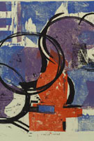 Louis Schanker (American, 1903–1981)
Circle Image
Color woodcut, 1952
Norrie Fund, purchased from the artist
Louis Schanker (American, 1903–1981)
Circle Image
Color woodcut, issued by the International Graphic Arts Society (IGAS),
1952
Norrie Fund
Reba Stewart (American, 1930–1971)
Abandoned at an early age, Reba Stewart grew up in Florida and moved
to Boston at age eighteen, supporting herself by odd jobs while attending
the School of the Museum of Fine Arts. She began as a painter but chose
to explore other disciplines and found herself challenged by the technical
aspects of woodblock printing. Stewart traveled to Japan in 1957 and
studied with master printmakers in Kobe and Kyoto. She experimented with
ideas and techniques and combined paint, silkscreen, and printing from
a veneer board. She received her Master’s degree from Yale University,
and went on to teach at Monticello College in Illinois and the Maryland
Institute College of Art. While on sabbatical in Africa, she contracted
malaria, and died that same year.
Reba Stewart (American, 1930–1971)
Mountain Range
Color woodcut, issued by the International Graphic Arts Society
(IGAS), 1957
Norrie Fund
This print was issued by IGAS the year Stewart spent in Japan. It is
a surrealist image rooted in nature, printed in a subtle combination
of nine colors, blending aspects of Western art with the ancient woodcut
techniques she studied in Japan.
Carol Summers (American, born 1925)
Travels to Italy, India, and Mexico left lasting impressions on Carol
Summers. He was deeply impressed by the art of India, particularly the
vivid miniatures of the Malwai school. His titles often mention places,
not so much to identify a specific geographical site, but rather to serve
as a reminder and an evocation, through color and images, of a time,
a place, a people. Summers generally works with a single block, and the
paper is cut slightly smaller than the wood matrix. He places the paper
on top of the block and runs an ink-charged roller over it (he virtually
paints with the roller). The ink is deposited on the paper where the
roller comes into contact with the raised woodcut beneath. He then sprays
the printed sheet with mineral spirits to blur and soften the inks of
various colors, which meld with each other and the paper. Some woodcuts
are printed on both sides of the sheet, saturating the paper with color.
Currently living in California, Carol Summers continues to make woodcuts.
Carol Summers (American, born 1925)
Rajasthan
Color woodcut, 1967
Bequest of Una Johnson
The intense reds in this print recall Summers’s journey to Asia.
Cy Twombly (American, born 1928)
Cy Twombly was born in Lexington, Virginia, and studied at Washington
and Lee University in Lexington, the School of the Museum of Fine Arts
in Boston, and the Art Students League in New York. In 1951–52
he spent a semester at Black Mountain College, a liberal arts college
in North Carolina whose founders, among them Josef Albers, encouraged
an experimental, broad-minded, and intellectually creative spirit among
its community, which included Robert Rauschenberg, John Cage, and Merce
Cunningham. The college also played a significant role in the revival
of small-press production, initiated by some of the poets on staff, such
as Charles Olson, Robert Creeley, and Robert Duncan. Twombly’s
drawings and paintings are compositions of highly personal gestural “handwriting,” and
he has never been particularly inclined toward printmaking, feeling that
the technical aspects impose too many constraints on his mode of expression.
Cy Twombly (American, born 1928)
Cover for The Song of the Border Guard by Robert Duncan
Linoleum cut, Black Mountain Graphics Workshop, Black Mountain College, North
Carolina, 1952
Wallach Fund
This linoleum cut is an interesting example both of Twombly’s
initial exposure to Abstract Expressionism at Black Mountain, and of
his endeavor to translate his style into a print medium that is so distant
from the immediacy of his preferred methods of drawing and painting.
Richard O. Tyler (American, 1926–1983?)
Richard O. Tyler was born in Lansing, Michigan, and during World War
II served in the U.S. Army Parachute Infantry in the Pacific Theater.
After a year of civil service duty in Tokyo he returned to the United
States. From 1948 to 1952 he studied at the Art Institute of Chicago,
and in 1958 he established Uranian Press, on New York’s Lower East
Side, where he and other artists created hand-printed books, posters,
broadsides, and print editions that he sold from a pushcart. Tyler filled
the roles of editor, printer, woodcut artist, and writer, and also had
keen interests in astrology and Jungian theory. Little is known of Uranian
Press after 1959, but it appears that by the 1970s it had become Uranian
Phalanstery, where Tyler, then known as The Rev. Relytor, practiced ritual
Tibetan tattooing.
Richard O. Tyler (American, 1926–1983?)
Jupiter, from The Planets
Portfolio of 20 color woodcuts with patterned cloth-bound cover
New York: Uranian Press, 1958
Gift of the artist
Tyler’s description of this portfolio is as follows: “The
colors used are red, blue, and the overprinted combination of these two
colors. Red represents the Logos principle, and is used on the Sun, Mercury,
and Mars. Blue represents the Eros principle, and is used on the Moon
and Venus. Jupiter, Saturn, Uranus, and Neptune are three color prints.
All copy is in red and overprinted on the second plate, making two prints
per planet.”
Ansei Uchima (American, 1921–2000)
The work of Ansei Uchima reflects a complex fusion of Western and Eastern
artistic traditions. Born in California, Uchima returned to Japan at
age nineteen, and after World War II studied painting and traditional
Japanese printmaking. Through his job as translator for Oliver Statler,
an American print collector, who was interviewing artists for a book
on contemporary Japanese prints, he was introduced to the sosaku-hanga (creative
print) movement, which incorporated a Western modernist aesthetic. Like
other artists in the sosaku-hanga school, Uchima carved, inked,
and printed his own wood blocks, enjoying the accidents and unexpected
opportunities that arose spontaneously from interaction with the wood
block. His first prints, beginning in 1957, drew from nature and the
world around him. After he returned to the United States in 1959, his
floating, calligraphic compositions, characteristic of sosaku-hanga,
suggested the growing influence of Abstract Expressionism. Uchima used
Japanese paper made especially for him by a Japanese master papermaker
and National Treasure, Ichibei Iwano.
Ansei Uchima (American, 1921–2000)
Joy
Color woodcut, issued by the International Graphic Arts Society (IGAS), 1958
Norrie Fund
Ansei Uchima (American, 1921–2000)
By the Lake
Color woodcut, issued by the International Graphic Arts Society
(IGAS), 1961
Norrie Fund
Lynd Ward (American, 1905–1985)
Lynd Ward was a pioneer in narrative illustration, known for his proficiency
in creating “stories without words.” Born in Chicago to a
Methodist minister father, he spent his childhood in Illinois, Massachusetts,
and New Jersey. He attended Teacher’s College, Columbia University,
and after graduation traveled to Leipzig, Germany, to attend the National
Academy for Graphic Arts, where he learned wood engraving. There he met
Belgian artist Frans Masereel, who introduced him to the idea of a story
told only through images. Returning to the United States, he settled
in New Jersey, where he began creating “wordless” books,
composed solely of wood engravings. He went on to illustrate more than
one hundred books, including classics for the Limited Editions Club and
several children’s books.
 Lynd Ward (American, 1905–1985)
Bridges at Echo Bay
Wood engraving, 1947
Gift of the Richard A. Florsheim Art Fund
© Robin Ward Savage and Nanda Ward
Lynd Ward (American, 1905–1985)
Undercliff
Wood engraving, issued by The Woodcut Society, New York, 1948
Norrie Fund, purchased on subscription to The Woodcut Society, New York
Lynd Ward (American, 1905–1985)
North of the Height of Land
Wood engraving, 1950
Gift of the Richard A. Florsheim Art Fund
Adja Yunkers (American, born Latvia, 1900–1983)
Early artistic influences on Adja Yunkers’s woodcuts—Wassily
Kandinsky, Franz Marc, the German Expressionists, and Emil Nolde—reflect
his early peripatetic life. After fighting in the Russian Revolution
he fled to Germany, then traveled to Cuba and Mexico, before settling
in Sweden in 1939, when he encountered Picasso’s work and became
intrigued by the Surrealist use of metaphor and myth. Yunkers later claimed: “History
for me started with my landing in New York in 1947.” There he taught
at the New School, joined a lively coterie of European avant-garde artists,
and, through Louis Schanker, met other innovative woodcut artists. Both
in New York and in New Mexico, where he set up a workshop, Rio Grande
Graphics, Yunkers produced numerous monotypes and color woodcuts of great
complexity and increasing scale, built up with layers of opaque and translucent
inks, each block carrying more than one color. Sometimes he used nontraditional
tools on the block, such as a wire-brush, to create texture. He did not
print uniform editions, but inked and printed the blocks differently
each time, occasionally even modifying the blocks during printing.
Adja Yunkers (American, born Latvia, 1900–1983)
Blue Lovers
Color woodcut on black tissue, 1945
Adja Yunkers (American, born Latvia, 1900–1983)
Head of a Traveler, from a portfolio of five color woodcuts
New York: Ted Gotthelf at Rio Grande Graphics, 1952
Norrie Fund, purchased from Ted Gotthelf
Adja Yunkers (American, born Latvia, 1900–1983)
Miss Ever-Ready, from a portfolio of five color woodcuts
New York: Ted Gotthelf at Rio Grande Graphics, 1952
Norrie Fund, purchased from Ted Gotthelf
Adja Yunkers (American, born Latvia, 1900–1983)
Three Personages, from a portfolio of five color woodcuts
New York: Ted Gotthelf at Rio Grande Graphics, 1952
Norrie Fund, purchased from Ted Gotthelf
Adja Yunkers (American, born Latvia, 1900–1983)
Composition
Color woodcut, issued by the International Graphic Arts Society
(IGAS), 1956
Norrie Fund
Next Section