|
Humanities and Social Sciences Library > Collections > Print Collection > Recent Acquisitions: Old Master Prints Artists E-M
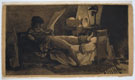
Joseph Fischer depicts himself convalescing in a darkened room, studying a work of art, illuminated by a single lamp. He heightens the gloom of the shadowy room by printing the image on tan paper. Though a convincing self-portrait, this etching was actually based on a print after a Richard Cosway drawing of the Polish General Tadeusz Kosciuszko. A volunteer in the Austrian cavalry, and later an officer in the campaigns against Napoleon in northern Italy, Fischer was wounded in the foot; the sword and musket and the toppled classical bust in the background of the etching allude to his dual career as artist and as soldier. Later he was an art consultant to the Hungarian Prince Nikolaus Esterházy and in 1803 accompanied the Prince to London, where he made seven lithographs (the Library has three of the seven in the Avery Collection). This self-portrait is a strong addition to the Library’s growing collection of late 18th- and early 19th-century German and Austrian prints.
Engraving arrived in Florence in the 1440s, more than a decade after its appearance in northern Europe. These early Florentine engravings have been classified into two groups: the “Broad Manner” and the “Fine Manner.” The Library has few 15th-century Italian prints in either of these styles. The engraver of this one—perhaps Rosselli—used broad, deeply incised lines to define form, and emphatic parallel lines for interior shading typical of the Broad Manner (in the Fine Manner, outline was less deeply engraved and form was shaded with a cluster of fine lines and delicate cross-hatching). However, recent scholarship indicates that shading in the Broad Manner could be achieved not only by long parallel lines, but also by thick, short lines, while the Fine Manner could also include parallel hatching, and that Rosselli worked in both styles, progressing from the Fine Manner to the Broad Manner. This print adds a fine example of Italian 15th-century printmaking to the Print Collection, and enriches its survey of 16th- through 18th-century ornament prints, which complement holdings in the Library’s Art and Architecture Collection.
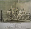
Daughter and pupil of the landscape painter Johann Stuntz, Marie Electrine von Freyberg was a painter and printmaker in her own right. Strengthening the Library’s holdings of early color lithography, Hercules and Omphale Cantata was made just a few years after Wilhelm Reuter’s 1805 efforts with a “tint” stone (an additional stone printed in color), in the S. P. Avery Collection. This print also indicates that women were among the circle of pioneers who tackled the new medium. S. P. Avery’s “Collection of Engravings, Etchings & Lithographs by Women” includes three lithographs by Electrine Stuntz, but this is the Library’s first example of her experiments with color. Hercules and Omphale Cantata is also a reminder that lithography was invented as a cheap and quick way to reproduce sheet music, maps, and other documents. Hercules and Omphale Cantata is a sheet music cover for a composition by the artist’s brother Joseph, and will join other early lithographic sheet music in the collection that already includes examples by Pierre Nolasque Bergeret and by Theobald Senefelder and his brother Alois Senefelder, the inventor of lithography.
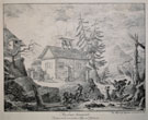
Ernst Fries was a painter (appointed court painter at Karlsruhe in 1831) and a printmaker, whose lithographs were praised by Goethe. He specialized in landscapes, often dotted with rustic buildings and cityscapes, which demonstrated his skills at architectural rendering. His short life ended by suicide in a delirium from scarlet fever. In this series of lithographs, aerial views of Stift Neuburg on the Neckar, Fries shows that he could capture in lithography the spontaneity and immediacy of his drawings and watercolors. According to Antony Griffiths and Frances Carey in their groundbreaking exhibition catalogue, German Printmaking in the Age of Goethe, this former convent had been transformed into an important artistic center by its owner, the Frankfurt councilor Friedrich Schlosser, one of Fries’s main patrons.
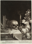
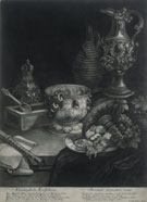
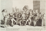
From a German family of artists and print publishers, Johann Jakob Haid was known for his large mezzotint portraits, of which the Library has several. Here he tackles a very different subject in two monumental mezzotint still lifes. With the attributes established in 17th-century Dutch still life painting, Everything Is Vanity is a compendium of imagery relating to vanitas and the ephemeral nature of life: a skull, an hourglass, soap bubbles, and an extinguished candle with a remarkably realized wisp of smoke. In Worldly Treasures Haid compiles an inventory of opulent “worldly treasures,” the glitter of bejeweled metal ewers and vases. Condition is always critical in evaluating a mezzotint, vulnerable to scuffing and abrasions, but these prints are justly described as “brilliant, velvety, black and extraordinarily rich.” Judging from the article “Still-life Mezzotints by Robert Robinson,” by James A. Ganz, it seems likely that Haid, who had worked in England, borrowed elements from Robinson’s prints in these mezzotints (particularly in Worldly Treasures). Robert Robinson (?1651–1706), a then popular British mezzotint engraver, publisher, painter, and stage designer (who may have studied in Holland or in the English studio of a Dutch painter), was best known for his still-life paintings and mezzotints. These were copied by other artists, including Dutch mezzotint printmakers Pieter Schenk and Jacob Gole, thus returning the favor to the Netherlands, which earlier had exported the mezzotint to England.
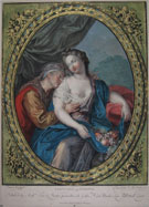
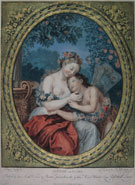
The second half of the 18th century was the heyday of French color printing. The Print Collection has only modestly documented this flowering. Examples in the collection often are in questionable condition, as is frequently the case with French 18th-century color prints, which customarily were framed and ultimately faded or turned brown from exposure to light or to acidic mats and frames. One of the leading exponents was Jean-François Janinet, who studied in the studio of Louis-Marin Bonnet, where he learned multiple-plate color printing. Responding to a demand for small gouache paintings and inspired by Bonnet’s experiments, Janinet perfected a technique that would approximate gouache (opaque watercolor), using a tool with minute points to create textured surfaces, which were then inked and printed in color from multiple plates. This pair of prints, with fresh color and in excellent condition, shows Janinet at his most skillful. The allegories of Spring and Autumn are each bordered by elaborate trompe l’œil gold frames, a device that had already brought Bonnet commercial success. To evade the French government’s restrictions limiting the sale of gold-leaf in France to a few specific trades, Janinet, like Bonnet, signed his prints with a pseudonym (“Engraved by H. Bzzi London 1776”); titles are in English with a London printseller’s address (his Paris printseller’s address is barely visible along the bottom). By marketing his prints as English imports, he could sidestep French regulations.
Like many of his contemporaries—including artists such as his engraving master, Jacob Matham, and the brothers Frans and Dirck Hals—Cornelis van Kittensteyn was an active member of the Haarlem civic guard. The annual feasts of Haarlem’s militia companies are immortalized in Frans Hals’s group portraits of the officers at their banquets, which may have been an inspiration for this engraving. The theme of drunkenness—here attributed to the smoking of tobacco as well as the imbibing of brandy and beer—is ubiquitous in the merry companies of Kittensteyn and his contemporaries. The delicacy of Kittensteyn’s engraving, however, belies the tawdriness of the behavior depicted. Apart from a modest etched title page in a book in the Rare Book Division, and a set of the Five Senses depicting “everyday life,” also after Dirck Hals, in the George Arents Collection, there were no other examples of Kittensteyn’s printmaking efforts in the Library’s collections.
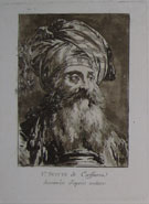
Jean-Baptiste Le Prince was one of the inventors of aquatint. In 1768 he began to explore various tonal processes, and by the end of that year, according to scholar John Ittmann, Le Prince “developed a resin-based aquatint.” Grains of resin sifted onto a metal plate, when heated, adhered to and served as a ground to protect the plate. When the plate was etched, the acid would bite around each particle of resin to create a soft grainy texture when inked and printed. Le Prince’s “exotic” heads demonstrate his mastery of his new technique. In recent years the Print Collection has acquired other early examples of aquatint: a suite of aquatints with etching by Abbé Jean-Claude-Richard de Saint-Non (also in this case), who independently made his own experiments with a tonal process around 1765, and Views in South Wales (1774–75) by the British watercolorist and printmaker Paul Sandby, who may have bought Le Prince’s formula through an English intermediary. The prints in the Le Prince suite, like those in the Saint-Non and Sandby albums, are early impressions, which capture the full range of tone and the delicate “washes” possible with aquatint. The choice of brown ink invites comparison with Le Prince’s bistre drawings.
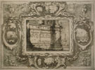
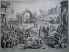
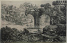
Italian 18th-century views of cities and landscapes draw upon two traditions: the topographical view (veduta), particularly in demand by tourists, and the imaginary landscape and architectural capriccio, conceived with artistic license and the conceits of a stage designer. The vedute of Luca Carlevaris, Giuseppe Vasi, and Michele Marieschi are well represented in the Print Collection, along with the more fanciful views and the capricci of Marco Ricci and the prints of Piranesi and Canaletto, who blurred the boundaries between the two traditions (Canaletto referred to his views as vedute ideate, or ideal views). Giacomo Antonio Mannini’s late 17th-century suite suggests that the capriccio was flourishing in Italy before the 18th century. He printed eleven separate plates with imaginary views of architecture, fountains, and landscape, each within a second plate, a repeated decorative border, which frames additional small views. His capricci often included ruins, which not only allude to Roman history, but serve as a reminder of life’s brevity.
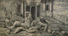
The acquisition of the monumental engraving The Effects of Wine, a fresh impression in excellent condition, significantly enriches the Library’s collection, which had only modest holdings of Italian prints from the first half of the 16th century. The identity of Master HFE, also called the Monogramist H.E., is not known. His mannered, contorted figures, set against a backdrop of classical ruins, were influenced by Michelangelo and probably by the Italian painter Domenico Beccafumi. Master HFE did not adhere to Marcantonio Raimondi’s regimented engraving system, working the plate with a freer and more delicate touch.
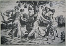
Jacob Matham’s engraving after Sebastian Vrancx’s The Rich Man at the Table and Lazarus at the Door was a reminder through a biblical story of the social contract that required the prosperous to help the poor. Vrancx relegates Lazarus and the dog to the background, and presents Dives as a prospering and cultivated burgher entertaining at his estate, framed by elaborate architecture and gardens, stocked with deer and peacocks. Well-heeled guests enjoy a sumptuous feast, listen to and play music, entertain each other and are entertained by actors and acrobats. Lazarus’s plight is scarcely visible in this celebration of worldly possessions and pleasures, which acknowledged Holland’s new cultural and economic position, albeit couched in a biblical story. Although the Flemish Vrancx contributed to the development of an indigenous landscape, influencing Dutch artists such as Esaias van de Velde, here he concocted a purely imaginary Netherlandish country estate, working within the tradition that shaped Gerard van Groeningen’s earlier illustrations of Ovid’s Metamorphoses, engraved by Jan and Lucas van Doetechum, also in this exhibition.
After François I returned to France from imprisonment in Madrid, he refurbished and expanded a hunting lodge at Fontainebleau. The interior was transformed by an ambitious program of decoration “in the Italian manner,” which included an innovative combination of painting and stucco relief, designed by several imported Italian artists, the most important and influential being Rosso Fiorentino and Francesco Primaticcio. Fontainebleau also nurtured a circle of highly original printmakers, including Pierre Milan, who was not previously represented in the Library’s collection. Milan’s Dance of the Dryads, inspired by Rosso’s medallion beneath the fresco The Sacrifice, in the Galerie François Ier, is a masterpiece of the Fontainebleau style, although probably executed in Milan’s Paris workshop.
Toward the end of the Napoleonic Wars, in late 1814 or early 1815, Godefroy Engelmann set up a lithographic press in his hometown, Mulhouse; by 1816 he had established a second press in Paris. From the beginning he was interested in printing artists’ lithographs rather than undertaking commercial work, which primarily had occupied the first generation of lithographic printers in France. Pierre-Antoine Mongin, a landscape and animal painter, was one of the first artists to collaborate with Engelmann. Grand in scale and in excellent condition, The End of a Tournament, dating from just a year after Engelmann set up his Paris shop, is a significant addition to the Library’s holdings of French lithographic incunabula in the S. P. Avery Collection, which includes an anonymous Cows and Sheep in a Meadow, printed by Engelmann at Mulhouse in about 1814, and Joseph Odevaere’s brilliant self-portrait, printed by Engelmann in Paris in 1816.
The artist (or artists) of this rare print and of several others also bearing the dual monograms “DB” and “IH” has yet to be identified. The landscape with classical ruins suggests that the artist was familiar with prints issued by the Antwerp publisher Hieronymus Cock (Flemish, 1507–1570) as well as with Cock’s own engravings inspired by an Italian sojourn. Print scholar and dealer Paul McCarron has suggested that he may be the artist mentioned by the art historian Konrad Oberhuber as the “still enigmatic DB.” Oberhuber attributes to the 18th-century collector Jean-Pierre Mariette the association of DB with Dirck Barendsz (1534–1592), a Netherlandish artist working in Venice. McCarron also notes that the print cataloguer G. K. Nagler suggested that the artist may have been Swiss, active in Italy or France around 1555–58. The ornamental qualities of the print, with its decorative arrangement of vegetation, ruins, and incidental genre scenes, could suggest, as McCarron points out, the hand of a silversmith. Nagler lists a set of pattern sheets for ornamental vessels, monogrammed “bd” and dated 1558. All the prints with the dual monograms share a velvety texture and an inky plate tone. |